Hi it's Brenda back with you today. You know when I started this project there was still snow on the ground so when I went back to look at the colours to use I thought how warming they were and very Springlike too. What do you think?
Here is my colour palette for this project.
Seal a size 9 tag with gesso and take a stencil and apply white crackle paste through it and leave to dry.
Mix a deep burgundy colour, made a watery wash and dip, spritz and dab before heat drying.
Then mix the rose pink colour and use a natural sponge to daub on some colour.
Added white to the rose to make the lighter pink and dribble, spritze and daub to get most of the tag coloured up.
Here I took my cue from the photo and having mixed the yellow I wanted I used my finger to apply it randomly around the edges not pressing too hard but rubbing my finger over the textures that were forming.
I finally got to make the orange and again looking at the raindrops I made a watery wash and splattered it over - another messy stage and not a good looking finish either but hold on (sorry I forgot to take a photo of that step) ..........
I cleaned up the mess on my craft mat and foil palettes ....
.... mixed some watery white and just kept dipping, drying, dipping, spritzing etc until I was happier with the background again.
Now to grunge it up a bit, I mixed the dark burgundy which actually came out more as a reddy brown and dripped watery washes through the stenciled image and dried it again. I also rubbed a small amount around the edges to start to frame the tag. This helps bring the eye into the centre of the piece again.

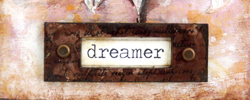
At this point I remembered I was going to include some stamping but thought this might make it too busy so I grabbed a word label and painted it and found some glass cabochons (taking my cue from the water on the petal in the flower again) and glued them to some text paper .....

.... and when dry painted the backs with yellow to bring some colour to them then added them to the background.
The label I stamped and gave a coat of satin varnish and added a couple of brads to finish it off.
At the end I had great issues with the contrasts and shadowing of the stencilled shape and I'm still not totally happy with it but at the moment it's as good as it gets. It's been repainted a couple of times and I think I'm happier with it in real life, more than the photos so please bare with it. At least the colours still have a bit of a resemblance with the original colour palette lol.
Thanks for stopping by.
hugs Brenda xxx
Supplies


No comments:
Post a Comment