Showing posts with label kim moody. Show all posts

Friday, 29 April 2022

24 Boxes of Advent - Follow a star - by Kim

Here is the next in my series of 24 Boxes of Advent.
 
Follow a star ... but which one? There are trillions to choose from!

I couldn't get them all on this box, so you'll have to use your imagination. My inspiration was the wonderful photographs taken from the Hubble Space Telescope.

Once I'd glued the box together I base coated the whole thing, inside and out, with Lamp Black.

Because my nebula is small I used an old and worn out brush for the stippling. All colours are stippled on so they blend easily.

The centre of the nebula is Cadmium Yellow. Make the colour more dense at the centre. Next up, and mainly towards the left of the picture, is Tangerine. Start by covering some of the yellow so the colours blend and gradually change from one to the next. Scarlet is next, stippled on as before. Then Calico Red. The red doesn't cover too well, which is good for the blending process, the density can tail off as you stretch in to outer space. You will probably need more than one coat for the denser areas.


To the right I used Primary Blue with tiny dabs of white blended in roughly. As the blue area gets farther from the centre it becomes less dense and eventually fades in to space.

At the centre of the nebula I added some tiny white 'splits' in the yellow layer showing the white heat of the core.

Next, the rest of the universe. I diluted a couple of drops of Titanium White with water to make it a milky consistency, then with an old tooth brush, spattered the stars over the surface. Try out your technique on scrap paper before you aim at your project - it could be messy!

Choose a couple of larger stars to have extra sparkle. With a fine point like a dip pen or cocktail stick paint in six or eight starburst lines. Make them taper away from the centre. Worth practising on a spare surface for this, too.

Once all is dry, mix some diluted black and add shadowy clouds in a couple of areas.

As this is my fourth Advent box I cut a number 4 from spare greyboard, painted it black, then added first Tangerine, then white highlights only to the edges that face the glowing nebula.

Thank you for journeying around the universe with me.


 Products:

Thursday, 21 April 2022

Product Focus - More Door Hangers - by Kim

 Just for fun! 

I was recently struck down by the dreaded Covid lurgy, and it gave me an idea ... how about a door hanger warning sign! It would serve as a reminder that I was infectious and everyone should keep away. In olden times I would have carried a bell and wandered about the streets moaning, "Unclean! Unclean!" 

But we live in more enlightened times (or so you would think!), and while the ideas were flowing, how about a hanger for those who work shifts and are asleep while the rest of us are awake?

And of course, one for the stroppy teenager who won't communicate because us adults just don't understand, but eventually comes round when food is on offer.

So here are my fun hangers. Can you think of some other important messages they could carry?

Stop. Covid Zone: Front; Yellow and black quartered background, hand lettering in red. Back; Three greens scumbled as background, red lettering with white blocking. And a big tick. 

I'm Awake: Front; Light blue and white scumbled background, yellow letters, dark blue blocking and red decoration. Back; Darker blue and white scumbled background with some lightly applied clouds in white, white letters, black blocking.

Go Away!; Front; Solid black background, orange lettering with red blended over the bottom half. Back; Red, pink, and white scumbled background, letters based in yellow the gold over the top, outlined in black. Gold dots on the background.


The Obverse - for Covid, shiftwork, and stroppy teenager.


The Reverse - for Covid, shiftwork, and not-so-stroppy teenager.

Thanks for dropping by - I'd love to see what messages you put on your hangers!

Product:

Tuesday, 29 March 2022

Hex Tech Tuesday - A Beacon of Hope - by Kim

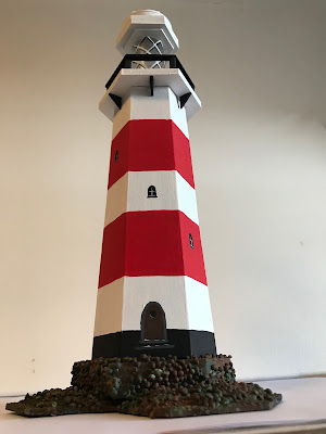
 Let's make it difficult for ourselves! All the best lighthouses are tapered towards the top, so my challenge was to achieve that with the Hexagon kit.

We'll start with the tower. You'll need an empty cereal box, a hexagon with 3cm sides, and a hexagon with 4cm sides. My tower section is 20cm tall. Mark out the shape on the cardboard box (see diagram at the end - it's easier than trying to explain in words!).

Cut out the complete shape. I scored along the fold lines with an embossing tool and steel ruler, fold carefully and sharpen the folds with a bone folder.

I used a fast setting solvent glue for this bit. Starting next to the flap glue the larger hexagon in place with the first two sides - this will hold the hex better than trying to do just one side. Repeat with the smaller hex.

Allow the glue to set before you move on. Continue glueing just one side at a time until you come back to the flap. Glue the last side over the flap and hold until set. (Phew! that's the difficult bit done!)


I loosely stacked the shapes together to see what made an attractive shape before I started glueing.

Next was the platform with handrail.For this I glued three 4.5cm hexs together, topped with a 4cm hex. The hand rail is a 4cm frame. I found a bamboo stick from a plant pot label and cut six 1.5cm lengths for the uprights. Using solvent glue I arranged the uprights to support the handrail. When dry I glued this to the three larger hexs to form the platform. Arrange it so all the hexs are facing the same direction.


Later I found that the platform could do with being a little more stable so I cut some 1cmx1cm right angled triangles from greyboard sheets to help seat it on top of the tower.

The lantern is a plastic miniature rum bottle (hic!), cut off at the shoulder (be careful when using sharp tools!). This is glued top and bottom to two 2.5cm hexs.

The canopy was built using five 3cm, three rings left over from Industrial Elements, one 2.5cm hex, three smaller rings from Industrial Elements, two washers, two large nuts, two small nuts, all leftover from Industrial elements. You can use whatever you have to make an attractive canopy.

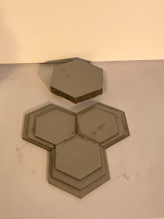
The central base  is made from three 5cm hexs and two 5cm frames. The base extensions are each of a 4.5cm, 4cm, and 3.5cm hex. These are arranged and glued as in the photograph to make a good stable base for the lighthouse.


Decoration:

The base was smeared with texture paste then large and small Art Stones were pressed in to the damp surface. This took more than 24 hours to set properly! When dry, with a stiff-ish brush, I dabbed a watery mix of Zinc all over to get in the nooks and crannies. Next came Burnt Umber dabbed randomly over the top, followed by Burnt Orange. Then to get the seaweedy slime look, some patches of Forest Green. The flat part of the base is Lamp Black.

The tower was gessoed first to cover as much of Kellogg's colours as possible (perhaps I should have used the plain side on the outside!) then at least two coats of Titanium White to get good coverage. I used True Red for the stripes, and Lamp Black for the damp proofing around the bottom. The door was added with Burnt Umber, outlined in Zinc. Zinc was used for the steps to the door. Windows are Lamp Black, Titanium White for the frames, Zinc for the window sills.


The platform is white with black handrails and supports and walking surface. I added a red band for fun. Underneath the supporting triangles are black.

The lantern has white plates top and bottom. I painted a white lattice pattern on the glass, with black shadows.

The canopy is white with one section in red and a red bit on the top.

This project used a whole set of hexs and leftovers from other kits. I measured the flat sides of my hexs. Use whatever you have to hand to make your lighthouse. Nobody with know what you have used once it has been painted! 

(Diagram for tower:
1 - set base line width A
2 - Mark vertical centre line 
3 - Set height B
4 - set top line width C
5 - Draw sides from ends of A and C
6 - Measure angle X (mark it on a spare piece of paper if you don't have a protractor)
To add sides:
7 - copy angle X as shown
8 - Draw top and bottom lines at that angle
9 - copy lengths A and C to new lines and draw fold line 

Repeat until you have six sides - then add a flap for glue (about 6mm))

Thank you for visiting - if you get stuck please ask and I'll help.

Supplies:

Hexagons for Hex Tech Tuesdays

DecoArt Americana Colours, various

Texture Paste

Art Stones (optional)

Odds, sods, and leftover bits

Monday, 21 March 2022

Faux Printers Block Clock - by Kim

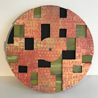
 I took my time (!) with this one as it needs thinking through. First I had to think through the colours scheme. There are three layers to consider. I started by choosing the top layer and worked the colours from that. I worked from a 12x12 Basicgrey scrapbooking paper, 'Infatuation' from their Fusion range.

Read Tando's instructions - they are included in the pack and will help. Don't try to rush this project.

First I marked the back of each of the greyboard sheets with the pieces to be removed later (each sheet is different) according to the instructions.

As the top sheet will have the patterned paper glued on, I removed the marked sections then laid the sheet, face down, on the glued paper. When dry I trimmed the paper and removed the outer ring.

The middle sheet was painted, I used Moss Green from the patterned paper as my lead, with a little white, grey, and black for interest. The marked sections


remained in place until the paint was dry.

On the MDF back sheet I painted black only the areas that would be visible, but you could paint the whole surface black if you wanted to. I glued the layers together making sure that all the sections lined up. I painted the exposed edge of the clock with black to keep it neat.

Next the numbers. There are a lot. Tando's instructions suggest they are left in the sheet to paint them. This is good advice. As I wanted to paint the sides of some of the numbers I had to remove them - but it was a fiddle. The big 12, 3, 6, 9 are grey with white sides.


The numbers on the patterned paper are grey, those on the green middle sheet are white, and those on the black areas are gold. I stuck them on with reference to the instructions.

Mount the clock works, the hands, and a battery (battery not in the kit) - and ... tick tock.

Products:

Tando Printer Block Clock

DecoArt Colours, various

Patterned paper of your choice


Saturday, 12 March 2022

Punch & Judy photo box - by Kim


 More blank boxes. This was originally going to be one box as a photo frame/box fitting for a Victorian family photograph - but it 'just growed'.

I used both the large shallow box and the large deep box. Let's start with the deep box.

I wanted a theatrical stage as my setting, so I marked out pelmet, curtains, tie-backs and stage. Using a very sharp craft knife I carefully cut out my shape. To add a little 3D effect I carved some additional texture into the edges of the drapery. I painted black all the surfaces that would end up inside the box, then glued the box together with PVA.

I painted the outside of the 'theatre' with a medium brown, then used Paynes Grey Fluid acrylic to add some shadows to the drapes. I also darkened the outline - like a vignette - with Paynes Grey so the detail would gradually fade away.

Once happy with the shading I outlined the drapes with Venetian Gold, to look more theatre like.


It was at this point, when looking for an appropriate photo, that the Punch & Judy idea struck.

So, back to my stash of leftovers. For the header board I used a piece of art board, the two wings (and other bits and pieces) are made from Tando Offcuts.

I base coated the header and wings with Primary Yellow, then dry brushed Scarlet, then Calico Red around the edges. I planned out the decoration very lightly in pencil - making sure the letters looked central.


I used Forest Green for the letters, with Venetian Gold embellishment to the 'thick' strokes. Then I added the brush stroke design in Calico Red, Titanium White, and Primary Blue. On the large strokes on the header I added gold. When painting the design on the wings I kept them side by side to make sure they matched. 

Next I added the gold coach line around the edge using a liner brush. I highlighted the line with a ruled line in black fine marker pen.


The drapes under the stage were cut from grey board, base coated in medium blue, Primary blue shadows and Blue Harbor highlights. A little gold for the tie-ups.

I glued the parts together with solvent based glue for a quick 'grab'. I made a couple of supports for the header board for extra support.

The second box is the shallow box. No cutting this time, just glue it together. Base coat with Titanium White (two coats). Then on one large side and two long edges I marked out the stripes for the canvas.

My stripes are 1cm, but to get them in the centre I started with a 0.5cm white stripe at the edge, this meant I finished the other edge with a white stripe, too. I painted the sides of the 'theatre' box to match the base.

The Calico Red stripes needed two coats. I used a No 4 liner brush to outline the sides of the stripes, then filled in with a small flat brush. To help the liner flow you can use a little 'extender' or 'flow medium' with the paint.

The base can be glued to the top if you like. Make sure it is centrally placed to look neat. To make the whole thing more stable I glued a spare mixed media board to the bottom, added a layer of DecoArt Texture Sand and some Mini Art Stones. When dry I used Burnt Orange and Moon Yellow stippled on to colour 'the beach'.

Select a suitable picture and place it in the 'theatre'. I found a picture of Punch & Judy, fussy cut round the edge, removed the faces and replaced them with my wife's and my faces, just for fun.

Products:

Tando Creative Blank boxes large deep and shallow

Tando Creative Offcuts

DecoArt Americana Colours, various

DecoArt Texture Sand

Tuesday, 14 December 2021

Product Focus - Door hangers - by Kim

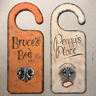
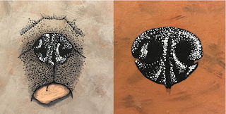
 How about these door hanging 'dog tags' for a quick Christmas (or any other time) present?

I've used Tando Creative's Door Hangers Style A, they are tough MDF hangers so should take any close attention the recipients should give them - well, for a while anyway.

I chose colours as near to the dogs' coats as I could remember. The background was a slip-slap combination of those colours. I checked on the internet for dog noses and used them as guides. Basecoated in black then added shiny highlights, first in grey then in white. Peggy's nose looked a little odd on its own so I added her tongue as well.

Lettering is in Burnt Umber and the hangers are edged in sponged on black.

And there we have a couple of quick presents for our furry friends. How about cat tags, or kids tags?


Tuesday, 30 November 2021

Kit Week - Large Whimsical Birds - by Kim

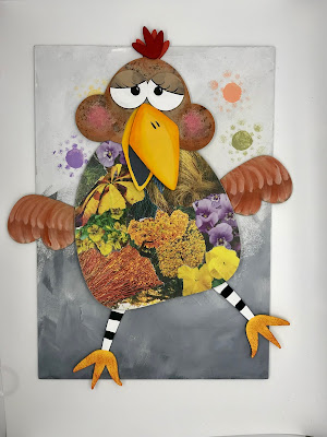
It's party season and Tando Creative's new Large Whimsical Birds are all dressed up and ready for a night in the barn!

I ventured in to unknown territory this time - no, not parties in a barn - decoupage! I rummaged through some old garden magazines and tore out lots pages with bright colours. I chose them for the colours, not necessarily the flowers. I stuck bits and pieces on the bird bodies to make pleasing combinations. Any magazine will do - just tear out colours and textures not whole pictures.

The legs got black and white stripy socks for contrast. I used DecoArt Fawn and Burnt Orange together on the wings to look a bit feathery.

I base coated the faces with Fawn, the large areas of the eyes with white, the centres with black. The eyelids are Fawn, the eyelashes are Black. 'Cheeky Bird' got a little blusher in a pale pink (Coral Shell with a dab of Calico Red) for her cheeks, and some Burnt Umber speckles. I also stuck the extra beak section on a bit skew-if so it looks like she is singing along to the music.

The feet and beaks are Primary Yellow. I lightly sponged some Burnt Orange on the feet to 'dirty them up'. For the shading on the beaks I used DecoArt Media Fluid Acrylics, slightly watered down, first Diarylide Yellow then Cadmium Orange Hue

The background is Titanium White with Zinc blended up from the bottom in wispy strokes to give the impression of feathers laying on the barn floor - all being kicked up as they dance the night away! Some pastel coloured 'strobe lights' are sponged through the bubbles from the new Background and Flourish Stencils.

I glued the wings and legs to the back of the body. Stick your Party Birds on the background and they are ready to display. Make sure you pose them in their dancing actions!


Products: 

Tando Creative Large Whimsical Birds Kit

DecoArt Americana Colours

DecoArt Media Fluid Acrylics

New Background and Flourish Stencils (Bubbles)


Friday, 26 November 2021

The World in a Matchbox - by Kim


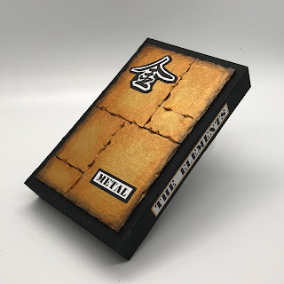
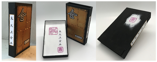
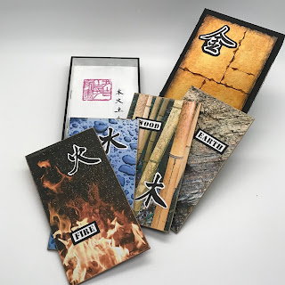
Ever thought it would be nice to carry your whole world in a matchbox? Well, I’ve sort of done it by putting all the Oriental astrological elements in one box; fire, earth, metal, water, wood.

I’ve used, from Tando Creative, their Matchbox, Medium with inserts. It arrives flat packed but assembly is easy and straightforward. I used ordinary PVA to stick it together.


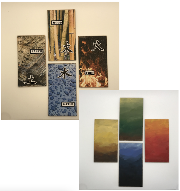
I decided that I would use four inserts and the cover would be the fifth element, and that would be a dramatic ‘metal’ finish. 


For the individual 'metal' plates I used pieces from Tando Offcuts. I chopped the edges randomly to to make them less than perfect, and more interesting, then glued them to the surface of the cover. (Be careful when using sharp blades!)


Base coat the entire cover - except the plates - with Lamp Black, including going inside by a brush width incase it is visible on the finished piece.


I painted two coats of DecoArt Venetian Gold on the plates so that it was well covered. Next I aged the edges by blending Quinacridone Gold Media Fluid Acrylic. Finally, I blended Paynes Grey Media Fluid Acrylic around the outside, to give more depth to the ageing.


Now to the inserts. I printed four pictures*, one for each of the remaining elements, and glued them on. I cut them slightly larger than the insert so that I could use coarse sandpaper to ‘blend’ the edges to fit.


To embellish the pictures I printed the Chinese characters and words. For the back of each card I used the element’s associated colour; earth - yellow, wood - green, fire - red, water - black,(metal is white) and a slip-slap graduated blend of DecoArt colours. A little gold wax rub-on round the edges finished it off.


Back to the cover. I added characters, words. and title to the outer. The inner tray was painted black outside and white inside. I stamped ‘I paint what I like’, added characters, and finished with ‘long life’.


(*Make sure you have permission to use the pictures)


Products used:

Tando Creative : Matchbox Medium with inserts

Tando Creative : Off cuts 50g

DecoArt Colours:

Venetian Gold Metalic acrylic paint

Lamp Black

Titanium White 

Media Acrylics:

Quinacridone Gold and Paynes Grey

Various colours of your choice for the backs

Also:

Gold rub-on wax

Pictures as appropriate 

Rubber stamps with Chinese characters